Dynamic Island - Apple’s Solution for the iPhone 14 Pro Notch
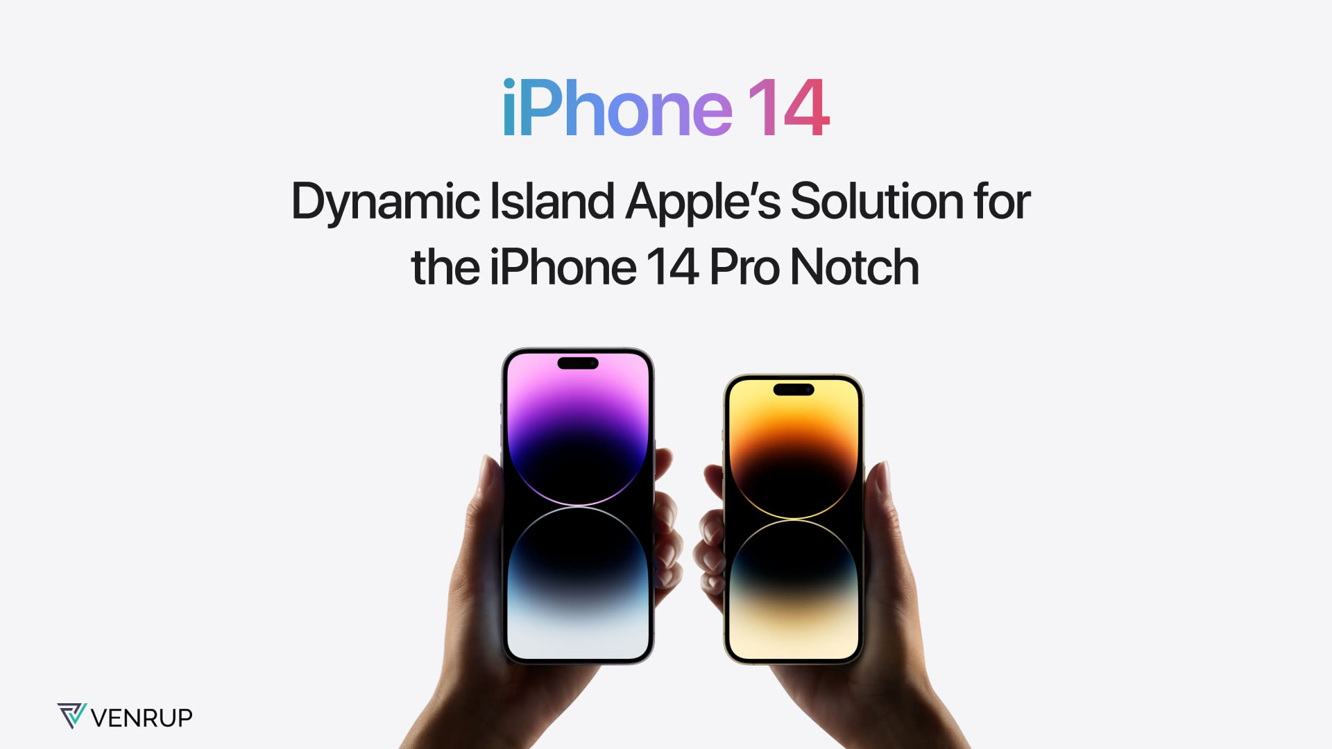
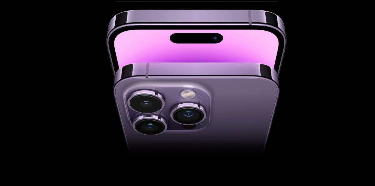
One of the biggest changes to the new iPhone Pro 14 this year is the replacement of the polarizing notch with a pill-shaped cutout - the Dynamic Island. All eyes are on this new feature Apple introduced in the iPhone 14 Pro line. This new standout feature is either one of Apple’s best designs or quite literally the opposite. Apple has received mixed reactions from users on the Internet regarding this new update.
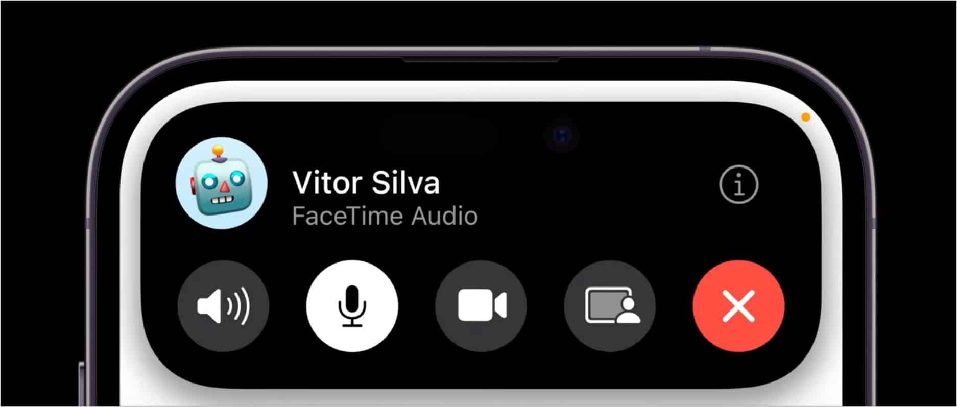
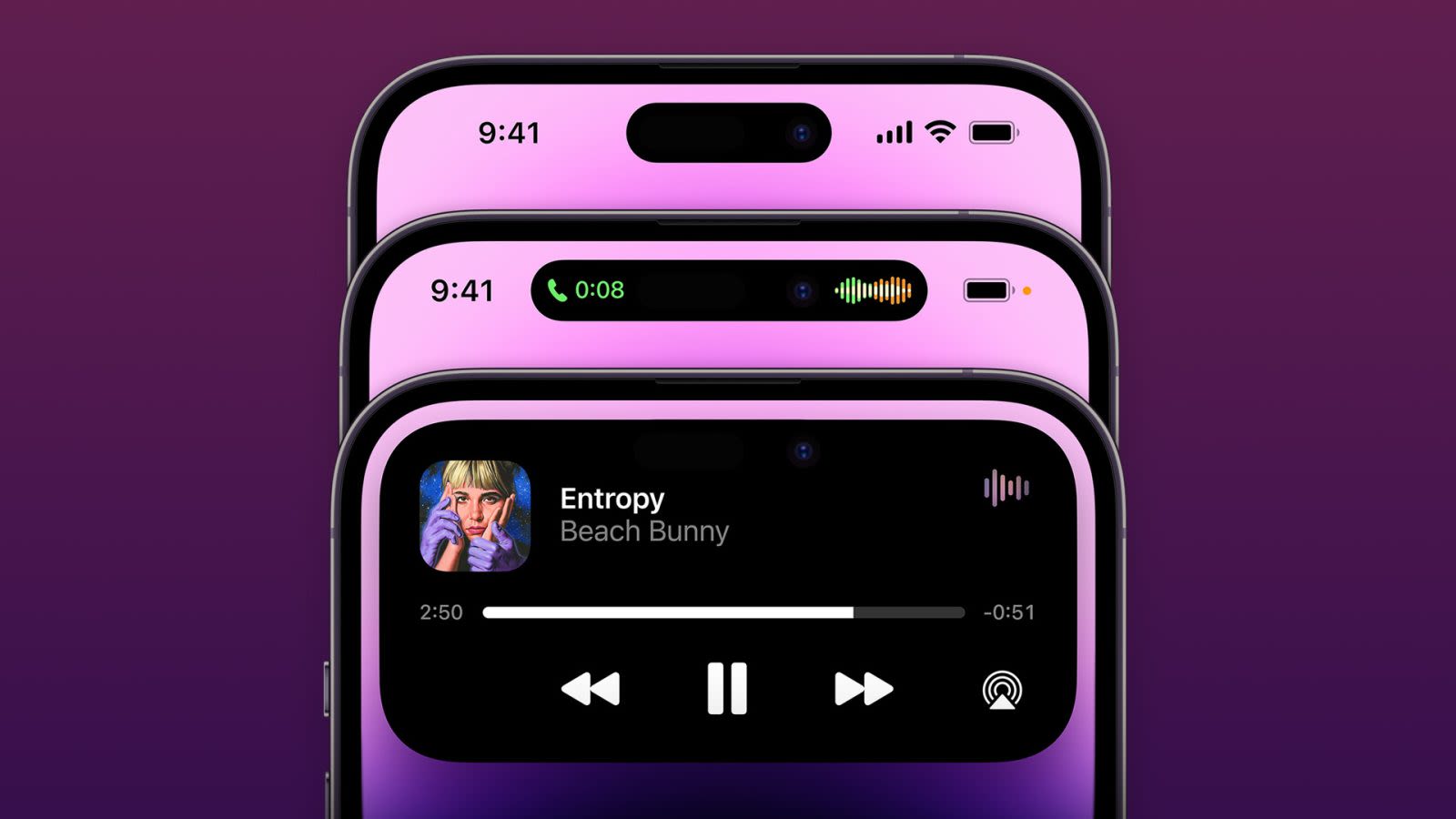
Apple has finally designed the UI around the notch. Dynamic Island is a black box that resizes the pill-shaped notch on the iPhone 14 Pro and iPhone 14 Pro Max. When you tap or long press on the notch, you can get more information as well as interactive information to access different functions. It can show you alerts, notifications and much more.
Let’s get into this in a little more detail.

When you first see the new model and compare it with the iPhone 13, there is a very insignificant change in design and the UI. There’s only a slight difference in design; the notch’s pill shaped now. And initially, many people weren’t all that excited for this new model. However, using the iPhone will give you the UI update that everyone’s talking about and all the interactive features that come with it. What can the Dynamic Island do?
Let’s take a look below:
Shows alerts and notifications

Gives access to controls

Keeps you updated in real-time

… and much more!
There is a steady flow of information on your screen with the Dynamic Island and you can browse multiple tabs on the same screen. All these features enable users to multitask more efficiently, such as having a phone call, or map directions without having to change apps.
Dynamic Island has certainly attracted both positive and negative opinions from tech enthusiasts and Apple fans. Some say Dynamic Island may be Apple’s best design work yet. Others say the new pill looks unattractive and has the same mechanism that Android phones have been using for years. But, Apple sure did use it to their advantage and made it the centerpiece of their new design with some cool UI elements and now serves as a main interface element of iOS. Apple’s Dynamic Island is a great inspiration for all UX designers. Apple used the notch, a somewhat limitation to their product since it did not serve any purpose in the previous models. They transformed the notch into a feature that’s pretty much useful and has a good user experience.

In conclusion, Apple used the notch problem to their advantage and gave us Dynamic Island - something no other mobile phone brand has given us. Though, it's too early to say. iPhone 14 Pro starts rolling out September 16 and we’ll be getting more reviews soon.
So, what do you think? Is this Apple’s brilliant design yet or do you have your doubts? Do let us know.